Simple Break Font: A Web Designer’s Layout Review
I was recently redesigning a landing page for a creative coaching client who wanted her site to feel bold and authoritative without sacrificing warmth. The previous design relied on a thin, elegant serif that looked beautiful on desktop but completely disappeared against the hero image on mobile devices. I needed a typeface that could anchor the visual hierarchy immediately, something with enough weight to stop the scroll but enough modern refinement to maintain trust. That is when I decided to test Simple Break in a live responsive environment.
As web designers and digital product creators, we know that choosing display fonts is often a gamble. You want personality, but you also need performance. After integrating Simple Break into several recent projects, including an online boutique storefront and a digital course sales page, I have found it to be a surprisingly versatile tool for modern web design. It strikes a specific balance between editorial confidence and digital utility that makes it worth keeping in your core typography toolkit.
Visual Hierarchy and Hero Section Performance
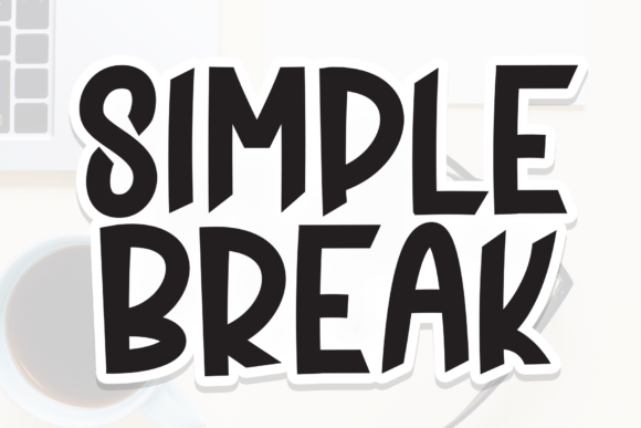
The primary strength of Simple Break lies in its ability to establish instant visual hierarchy. In web design, the hero section has roughly three seconds to communicate value, and this font does the heavy lifting efficiently. Its bold, clean letterforms are geometric enough to feel contemporary but possess subtle humanist touches that prevent the design from feeling sterile or overly corporate.
During my testing on a portfolio homepage, I used Simple Break for the main headline at 4rem on desktop. The x-height is generous, which is crucial for screen readability. Unlike some decorative display fonts that require massive sizing to remain legible, Simple Break maintains its structural integrity even when scaled down for tablet views. The counters (the enclosed spaces within letters like 'o' and 'e') are open and airy, preventing the ink from filling in on lower-resolution screens or when users have browser zoom enabled.
This openness makes it particularly effective for overlaying on photography. When placing white text over a busy lifestyle image for a brand banner, the solid weight of Simple Break provided enough contrast to meet WCAG accessibility standards without needing a heavy drop shadow or dark overlay that muddied the photo. For UI designers focused on both aesthetics and usability, this inherent legibility reduces the friction often associated with bold typography.
Responsive Behavior Across Mobile and Desktop
A font that looks stunning in a Figma mockup can quickly become a liability once coded into CSS. My biggest concern with any new display font is how it behaves in responsive containers. Simple Break translates exceptionally well to mobile viewports because of its consistent stroke width and balanced proportions.
On a recent e-commerce project, I utilized this typeface for collection headers and promotional banners. On desktop, the tracking felt natural and spacious. However, as the viewport narrowed to 375px, the font did not appear cramped or top-heavy. Many bold sans serif fonts tend to look aggressive or shouty on small screens, but Simple Break retains a friendly, approachable mood even at smaller sizes. This makes it a safe choice for mobile-first designs where space is at a premium.
For digital product creators selling templates or website themes, this responsive reliability is a major selling point. Your customers need assets that won't break their layout when they change the text length. Because Simple Break has such stable vertical metrics, it integrates smoothly into standard CSS grid and flexbox layouts without causing unexpected line-height shifts or overflow issues.
Strategic Font Pairing for Digital Interfaces
While Simple Break is a powerhouse for headlines, it is strictly a display font. It should never be used for body copy, navigation menus, or form labels. Its bold nature is designed for impact, not extended reading. To create a cohesive brand identity, pairing is essential.
- With Clean Sans Serifs: For a modern, tech-forward, or minimalist aesthetic, pair Simple Break with a neutral sans serif like Inter, DM Sans, or Outfit. The geometric clarity of Simple Break complements the functional neutrality of these body fonts, creating a high-contrast editorial look perfect for SaaS landing pages or digital agencies.
- With Elegant Serifs: For lifestyle brands, wedding portfolios, or luxury e-commerce, try pairing it with a refined serif like Playfair Display or Lora. The juxtaposition of the bold, modern display header against traditional serif body text creates a sophisticated "magazine" feel that elevates perceived brand value.
- With Monospaced Fonts: For creative portfolios or developer sites, a monospaced body font adds a raw, utilitarian texture that contrasts beautifully with the polished curves of Simple Break.
When setting up your CSS variables, ensure you define distinct scale ratios. I typically use Simple Break only for H1 and occasionally H2 elements. For H3 through H6, I revert to the body font family with adjusted weights. This restraint preserves the specialness of the display font and prevents visual fatigue.
Best Use Cases for Online Brand Experiences
Through various client projects, I have identified specific digital environments where Simple Break truly shines. It is not a universal solution, but in the right context, it significantly enhances user engagement.
Landing Page Headlines: Whether you are launching a webinar, a new product, or a newsletter, this font commands attention. It signals importance without resorting to all-caps shouting, which can sometimes trigger spam associations in users' minds.
Digital Product Mockups: If you sell printables, planners, or social media templates, using Simple Break in your listing images helps convey quality. It reads clearly in thumbnail size on marketplaces like Etsy or Creative Market, ensuring potential buyers understand exactly what the product is before clicking.
Social Media Graphics: Consistency between your website and social channels builds brand recognition. Simple Break works beautifully in square and vertical formats for Instagram and Pinterest. Its bold strokes remain crisp even after platform compression, making your shared content look professional and branded.
Call-to-Action Buttons: While generally too heavy for standard buttons, Simple Break can work effectively for large, primary CTAs in hero sections if used sparingly. Short phrases like "Shop Now," "Join Free," or "Get Started" benefit from the extra visual weight, drawing the eye directly to the conversion point.
Technical Considerations and Licensing
Before deploying Simple Break to a live server, there are practical technical details to verify. Always check the file formats included in your download. For web use, WOFF2 is the gold standard for performance. If the package only includes OTF or TTF files, you will need to convert them or rely on a hosting service that handles subsetting and optimization automatically.
Licensing is another critical factor for commercial web designers. Ensure your license covers web embedding for the expected traffic volume. Some desktop licenses do not include webfont usage, and violating this can lead to legal issues for you or your client. Additionally, if you are designing for international audiences, verify multilingual support. While Simple Break covers standard Latin characters beautifully, specialized diacritics for languages like Polish, Vietnamese, or Turkish may require checking the character map beforehand.
Finally, consider load times. Bold display fonts can have larger file sizes due to complex vector data. Implement font-display: swap in your CSS to prevent invisible text during loading. This ensures that even if Simple Break takes a moment to render, the user sees fallback text immediately, preserving the core message and SEO value of the page.
Simple Break has earned a permanent spot in my digital design arsenal because it solves real layout problems while adding genuine aesthetic value. It respects the constraints of the screen while bringing the boldness of print editorial to the web. For designers looking to add confident, modern typography to their next project without compromising usability, it is a reliable and stylish choice.